PMRC Presentation
At the Public Management Research Conference (PMRC) in Phoenix, AZ on May 27, 2022 I am preparing to present on the usage of data science tools and techniques (focusing my talk on data science capture, curation, and analysis). In anticipation, I have prepared some slides I am sharing here- SLIDES. Included are some fascinating papers applied to public administration, policy, and political science. I also include some useful Python and R packages if you are inclined to use these tools.
CDBG and HOMES Analysis
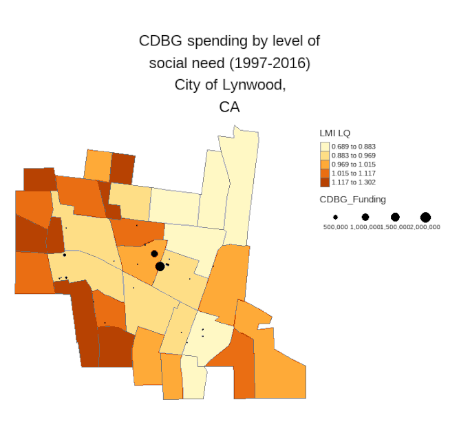
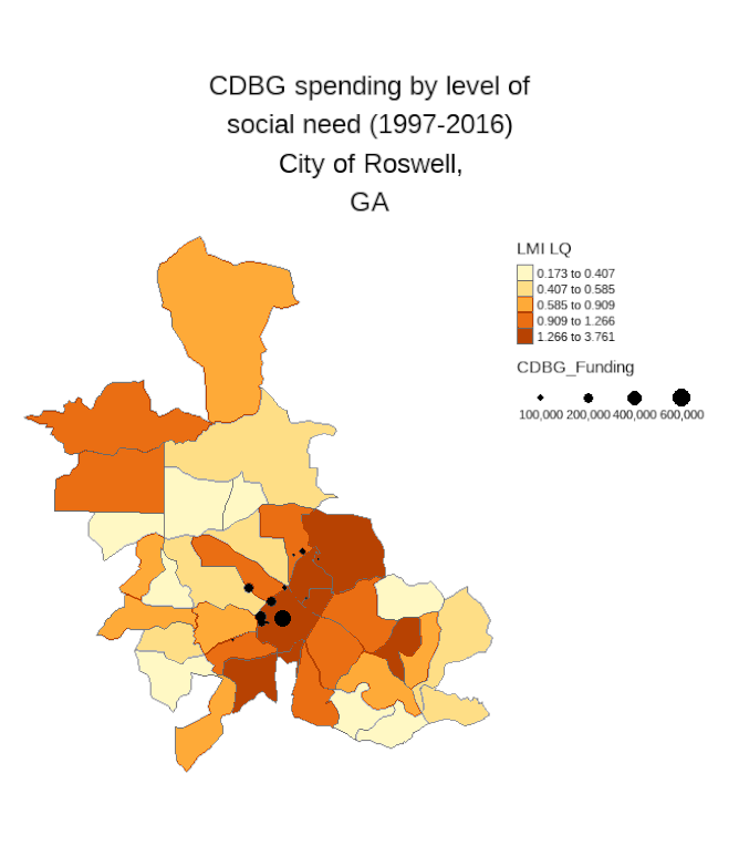
I'm working on an analysis of how well CDBG and HOMES investments are targeted to neighborhoods with the greatest level of social need and by race. Recently, I wrote a function to automate the production of 1,700 maps in R to visualize this. See the Medium article I wrote about it: here.
I'll highlight a couple of these visuals where the city targets the areas most in need alongside those where they fail to optimize for social equity. Notice that in Lynwood most of the investments take place in light colored tracts (meaning there is low social need). Contrast this with Roswell, GA where the investments are more targeted to those areas with higher need.
At the Public Management Research Conference (PMRC) in Phoenix, AZ on May 27, 2022 I am preparing to present on the usage of data science tools and techniques (focusing my talk on data science capture, curation, and analysis). In anticipation, I have prepared some slides I am sharing here- SLIDES. Included are some fascinating papers applied to public administration, policy, and political science. I also include some useful Python and R packages if you are inclined to use these tools.
CDBG and HOMES Analysis
I'm working on an analysis of how well CDBG and HOMES investments are targeted to neighborhoods with the greatest level of social need and by race. Recently, I wrote a function to automate the production of 1,700 maps in R to visualize this. See the Medium article I wrote about it: here.
I'll highlight a couple of these visuals where the city targets the areas most in need alongside those where they fail to optimize for social equity. Notice that in Lynwood most of the investments take place in light colored tracts (meaning there is low social need). Contrast this with Roswell, GA where the investments are more targeted to those areas with higher need.
More can be found in my working paper with Michael Overton and Aaron Deslatte, feel free to reach out for a copy.
Posted on: 1-19-2022- Who responds to the ICMA Economic Development Surveys?
Many of us use the International City/County Management Association (ICMA) data in our work. We often describe the geographical representativeness of these data. For some time I have wanted to map out the respondents across the United States over time. I capture all but Hawaii and Alaska, will add these in later once I can improve how to arrange them cleanly onto one map while overlaying the state polygon and ICMA dots.
Of course the map alone does not tell you how fully representative it is, but certainly we can see a geographic distribution of these places. We also can notice the declining number that often participate since the 2000s. There are occasional upticks; however, it has gotten more challenging to get these data collected.
Posted on: 1-16-2022 - Working toward Sentiment Analysis with Twitter Data
I have been thinking a lot about how citizens perceive various economic development incentive programs. But, there is a lack of data that covers this topic. Surveys are certainly appropriate, but can be expensive and response rates have presented challenges. Yet, many of us go and comment on various policies and programs through Social Media.
As social science scholars, we have an opportunity to leverage these data. Last night at the Southern Political Science Association Dr. Eric Zeemering hosted a panel of leading experts in public administration on the future of service delivery research. Much of the data that has consistently been collected over time is through surveys produced by the International City County Management Association (ICMA). These are useful data; however, we need to think about ways to verify, supplement, and refine them.
I think there are opportunities to do this today by leveraging the data we have openly available in unstructured formats through government websites (do governments put out RFPs for services- maybe we can scrape data to confirm what we see on the surveys going forward) or through government reports that consistently demonstrate with whom they contract (we can parse pdfs). There will be pitfalls, though we can be guided by the work of Matthew Salganik (See his book: Bit by Bit) and Christopher Bail for some use cases and considerations.
So back to my data collection efforts to try and understand how we view various public policy programs. This week I decided to go and grab all Twitter data containing certain public policy program references since 2017. I wrote a Python program, after getting a Twitter developer account, and then processed much of it in R. In total, I am working with about 1.8 million Tweets.
I'm curious about sentiment with respect to these programs and the Amazon HQ2 deal and I have many questions I hope to answer, so reach out if you're interested in discussing more. I'm just starting to process these data, but I thought it might be fun to make note of the most common words referenced regarding each of these programs. In the wordclouds produced with R, I cover three programs and the Amazon HQ2 example.
These are visually appealing, but don't really tell us a lot yet. The words are sized and colored by how frequently the word was referenced relative to every other word across all of the Tweets. The Build Back Better program had a much larger number of responses compared to most of the other programs (more than 1 million). These are not fully clean. In fact, they likely include some texts that have nothing to do with it because the terminology may not reflect the program but other words that were captured (Check out Opportunity Zone references to various sports teams). Thus, I have my work cut out for me- but it's an interesting start.
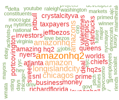
Word Cloud: Amazon HQ2
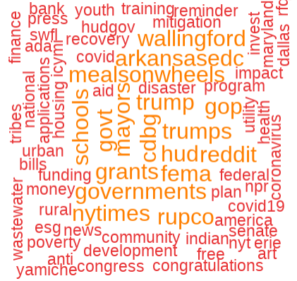
Word Cloud: CDBG
|
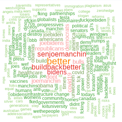
Word Cloud: Build Back Better
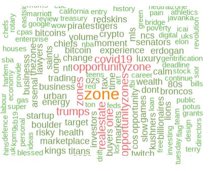
Word Cloud: Opportunity Zones
|
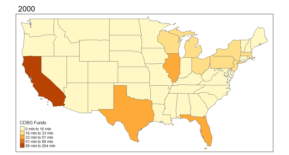
Posted on: 1-5-2022: Geospatial analyses of CDBG and HOMES data
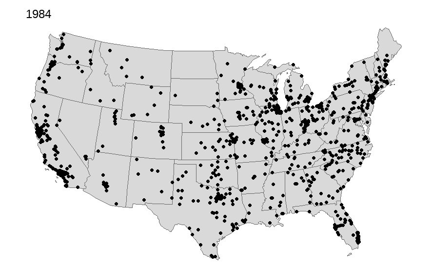
I begin by exploring the Community Development Block Grant (CDBG) program through mapping visuals. I want to see how the funds are distributed across states and over time. The first set of maps demonstrates this for 2000-2018 across the United States. It aggregates CDBG investments within the state for each year.
*Note: Throughout I cap the CDBG and HOME investments to $5,000,000 per individual place-level investment just for display purposes. There are extreme outliers that make the visualizations less appealing. This is more about illustrating the mapping of these data than it is evaluative.
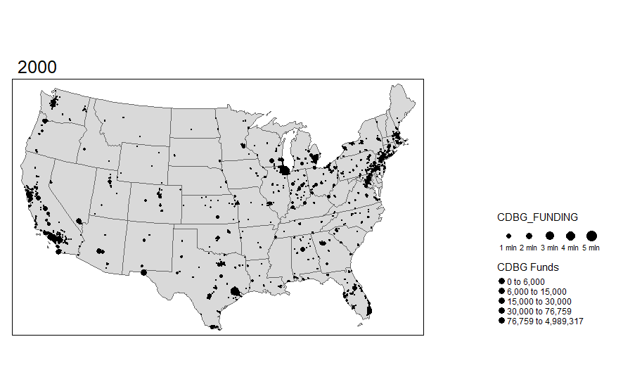
I was pretty surprised to see how much variation there actually is over time in these funds. I want to explore the actual points (latitude and longitude) where the investments are made. I can do this using the same functionality in R and sizing the investments by dollar amount. I'm truncating the top end investments simply because the investments are very skewed.
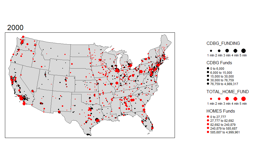
I'm also interested in seeing the overlap with HOMES investments. This is another U.S. Department of HUD investment, so let's add that layer to the map.
While these visual maps are neat to look at, it would be preferential to be able to display some of the data in an for a particular area like Dallas County, TX. We can always start with a static map.

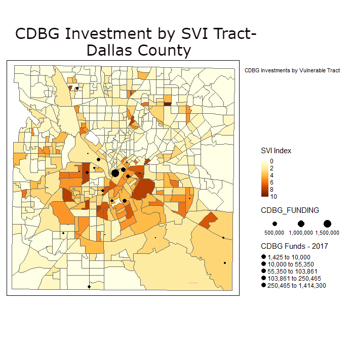
In this next map, I read in data from the Centers for Disease Control and Prevention (CDC) Social Vulnerability Index. This allows me to map out more and less socially distressed tracts in Dallas County, TX for 2018. I then, look at where CDBG investments are made in the County and overlay this on top of these districts.